Tutorial: Create a Watercolor Effect Vector Logo
Hi! I am excited to bring you my first tutorial. After posting my Mims House in-progress logos I got several people asking how I maintain the watercolor style in a vector logo! So here we go - a simple six step tutorial. This tutorial assumes that you have working knowledge of Photoshop and Illustrator. If you have any questions be sure to ask in the comments and I will answer the best I can!
First I am going to describe my process in words and then you can see the visuals below to put the whole story together!
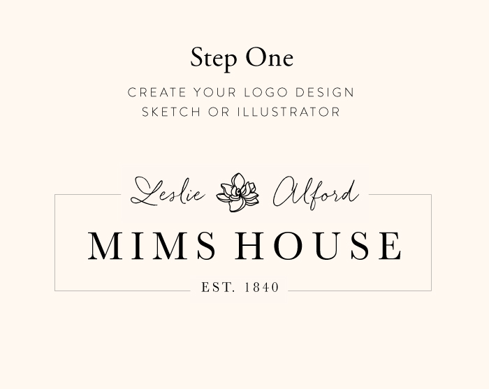
Step One: I always start my logo process by sketching on paper - but once I have a few concepts together I move to the computer to start making comps. I use these comps as the basis for my watercolor logo.
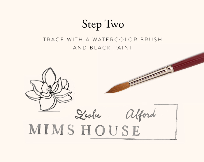
Step Two: Once I have my comps complete I print them out and then move to my light table and break out my paints and brushes. In this example I am creating a grayscale logo to start, so I use only black paint. You will notice the flower is larger, this is because I printed out a larger version of the flower so that I could capture the detail better. When tracing with my paint brush I like to add little details that are not in the font to make it more unique.
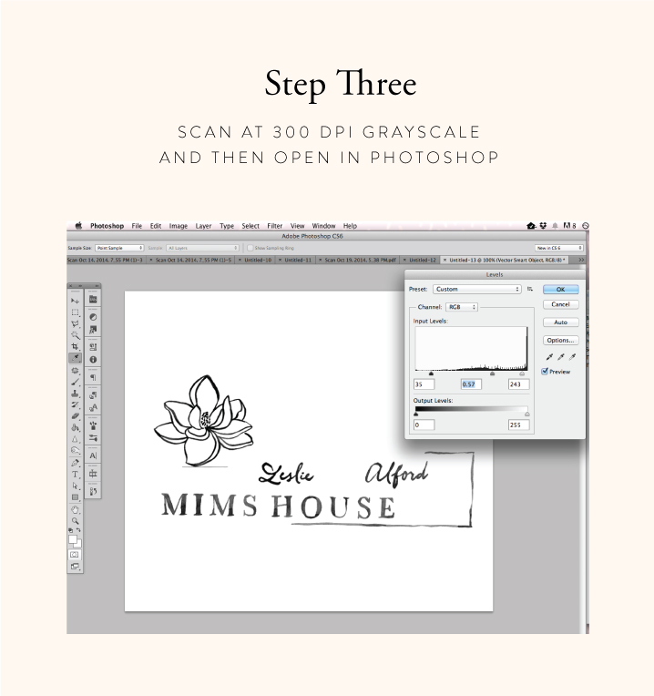
Step Three: After you have completed your painting and let it dry, scan the image at 300 dpi grayscale. Then open your painting in Photoshop and adjust the levels so that the background is totally white and the painting is darker. It is very critical that the background is solid white - you can also use the dodge tool to help clean up the image.
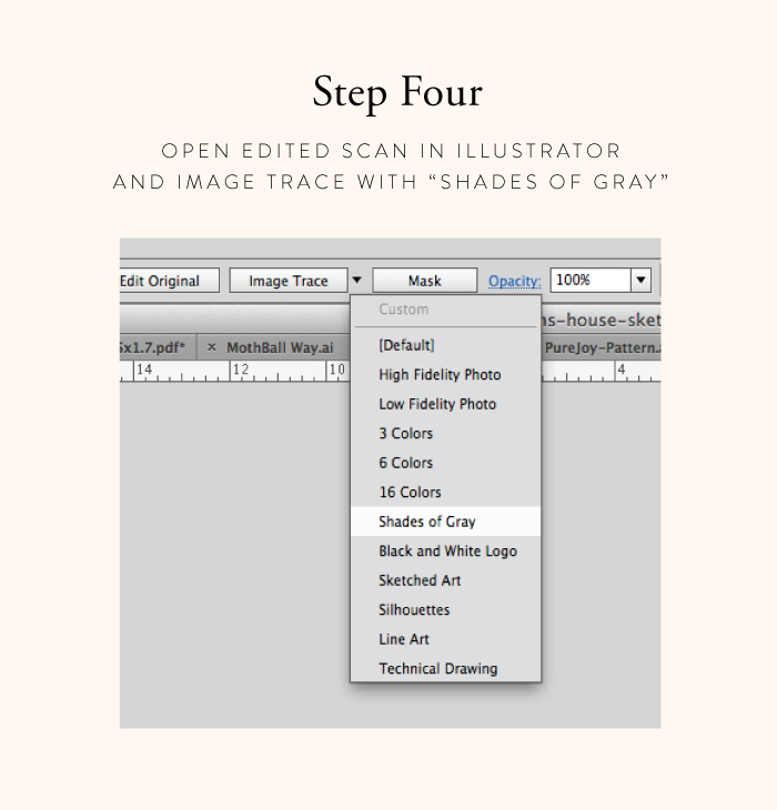
Step Four: Save out your photoshop changes and open the file in illustrator. Click on the image and select "Shades of Gray" from the Image Trace panel at the top of your window. You may need to open the Image Trace Adjustments panel to adjust the trace.
Step Five: When the trace is complete hit "Expand" and then you will notice that there is still white around your painting. Choose the direct selection tool (white arrow) and click on the outside of the white area. Then delete it. There may still be a few small white places left - these are actually light gray, just use your direct select or eraser tool to clean up around the image.
Step Six: Now all your elements are ready and you just need to arrange them to create your logo concept! Now that the image is entirely vector you can easily expand and contract your elements to create your final image. It is amazing how well the "Shades of Gray" image trace keeps the appearance of watercolor!
Hope you enjoyed this first tutorial. And please don't hesitate to ask questions in the comments!


